by Hank Long
A lengthy deliberation Tuesday among 13 Minnesotans tasked with selecting a new state flag and seal at times devolved into argument and confusion among some, with one member of the State Emblems Redesign Commission calling it “a colossal waste of time” for those who submitted the designs.
Others criticized any potential incorporation of the state motto “L’etoile du Nord” or the statehood date of “1858” into a new state seal or flag as “hurtful” to many with indigenous backgrounds.
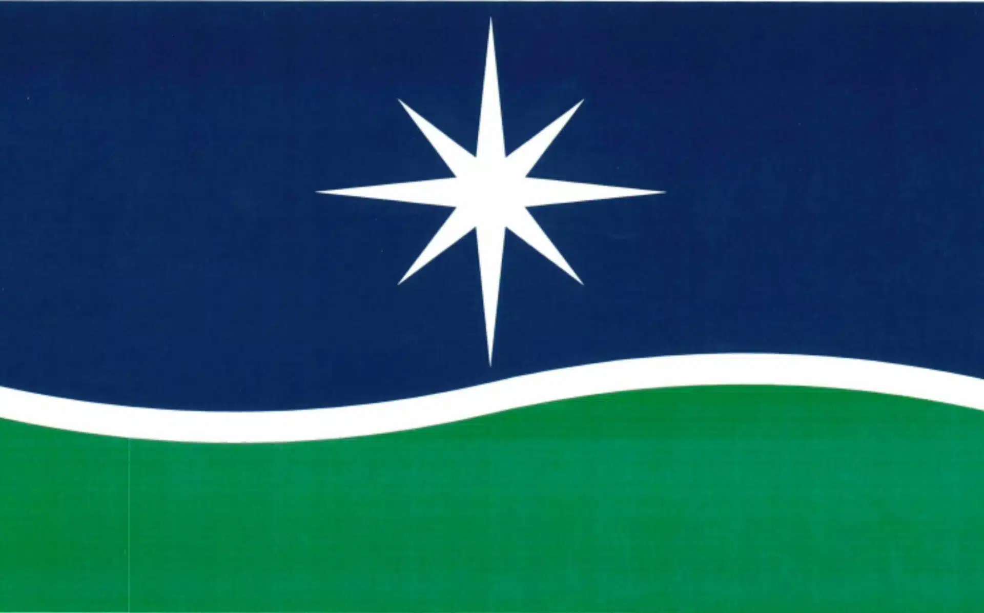
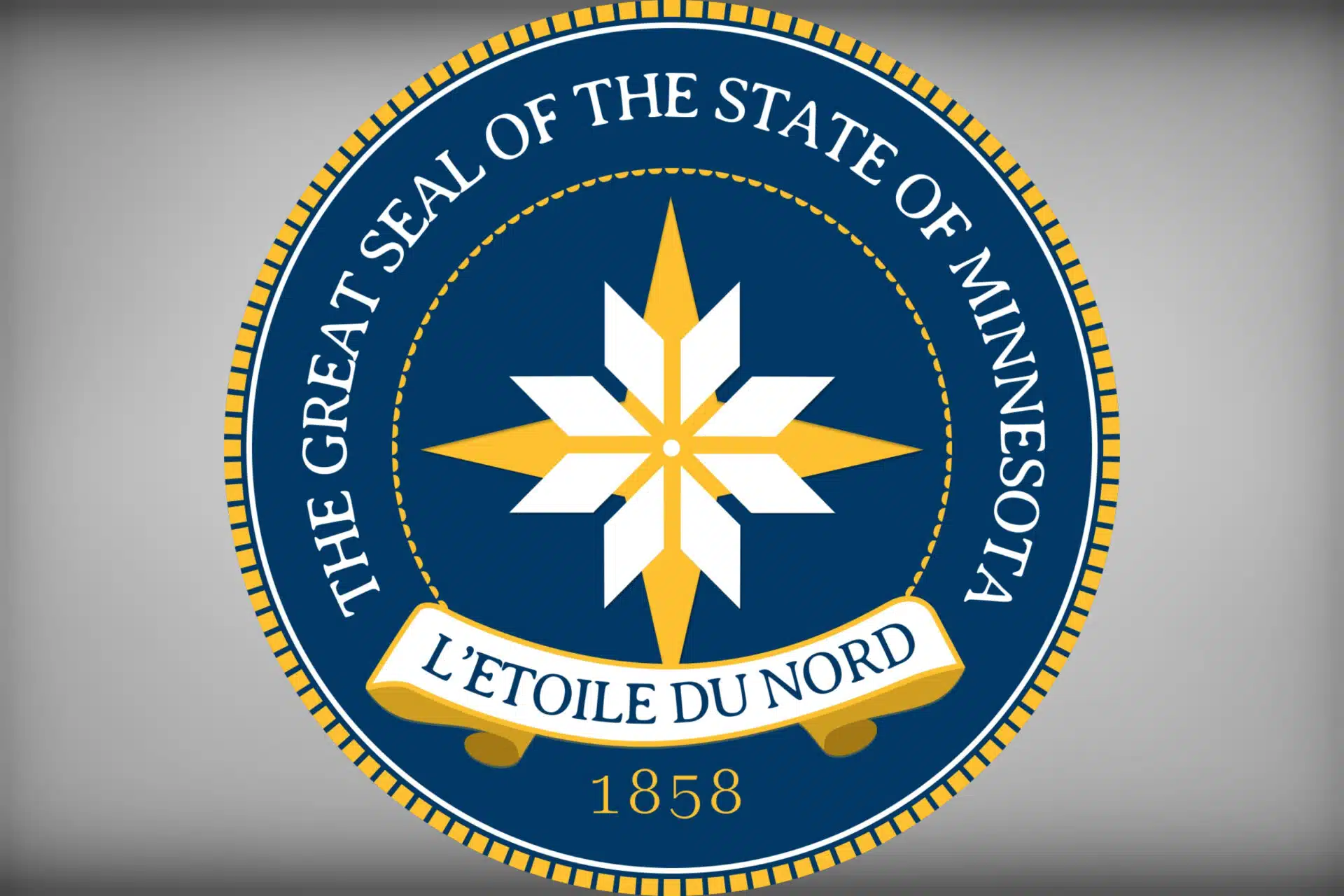
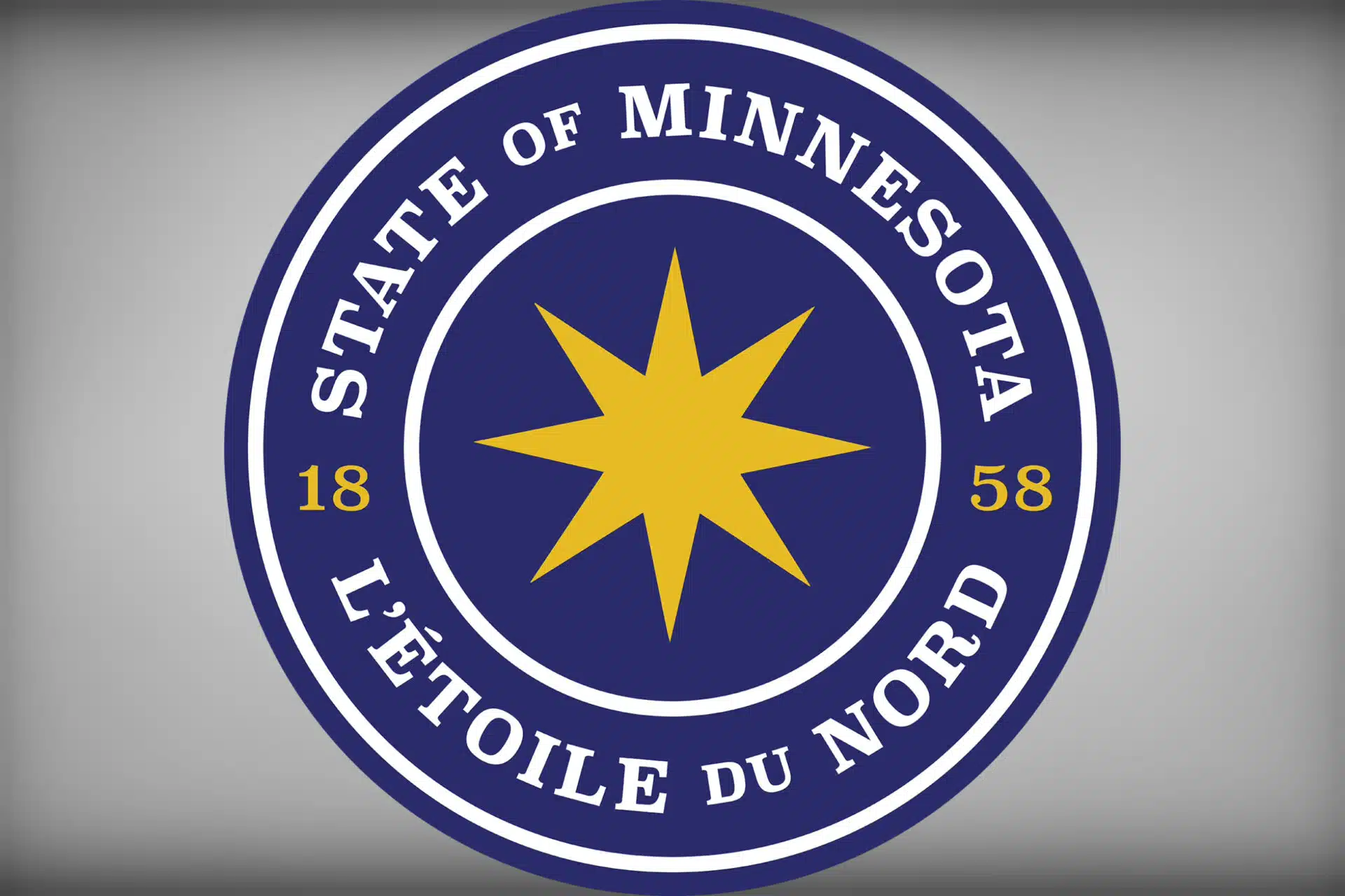
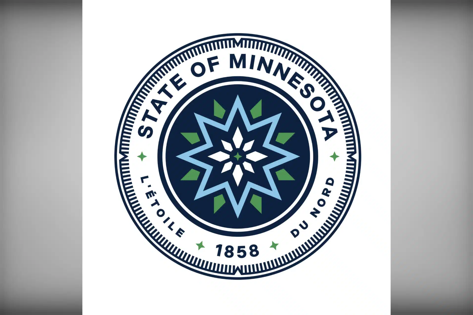
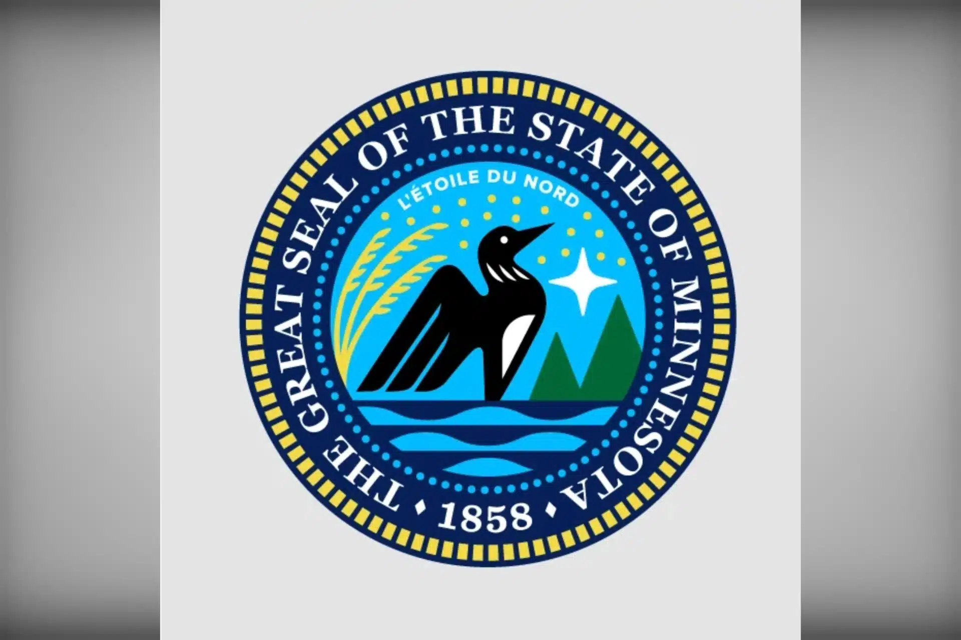
But ultimately, the State Emblems Redesign Commission — created via legislation passed this spring to retire the existing flag and symbol and pick new ones — was able to whittle it down a group of six flag designs and five state seal designs (that came out of a pool of more than 2,000 submissions) that it will now turn over to the public for feedback, before picking (and perhaps tweaking) two winners in December.
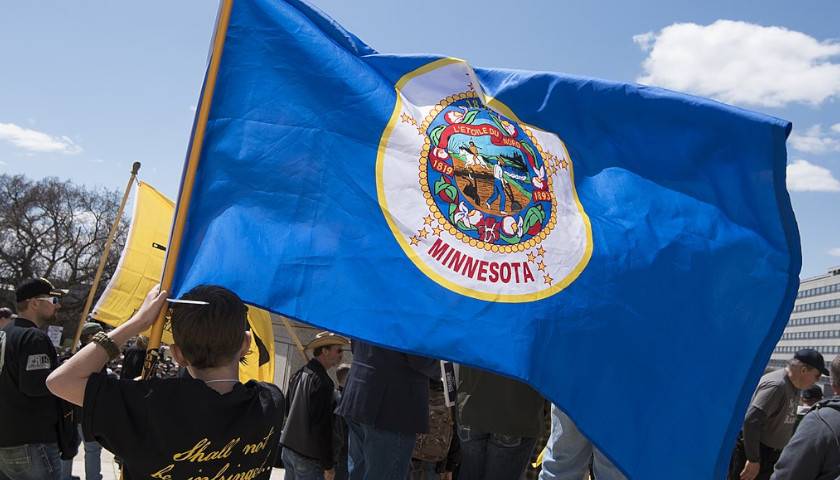
The commission has until New Year’s Day, per state statute, to come up with new designs for the state flag and seal that a DFL “trifecta” said were long overdue, partly because the existing flag and seal are poorly designed and contain racially insensitive imagery, they said. The language of the statute says that if the commission can submit its final design for the seal and flag, along with a corresponding report on its selection process, by Jan. 1, those designs will then officially become the new state seal and flag on May 14, 2024, which is Minnesota’s “Statehood Day.”
Here’s a look at the flag finalists:
Here’s a look at the seal finalists:
Last month hundreds of entries poured into the commission’s web portal. Submissions for both a new flag and state seal came from a wide variety of people, ranging from elementary students to professional graphic design artists. Since then commissioner members have been closely reviewing the submissions, which were also available online to the public.
On Tuesday, each of the 13 voting commissioners shared their 25 favorite designs for both the flag and seal. They deliberated over some of their consensus favorites, then took a handful of breaks in the hallway outside their Senate meeting room to express their preference from among those choices. They did so by affixing stickers to the backside of the submissions they liked most. One submission that was favored by an unknown member of the commission featured a raised, clenched fist, often seen in Marxist imagery.
Ultimately, it took just under eight hours for the panel to agree on six finalists for a flag and five finalists for a seal. The commission will turn to the public for feedback on those finalists and now has just more than a month to vote on one final design that it will submit along with a report to the legislature by Jan. 1.
Process ridiculed in hearing, and on social media
While the overall process was mostly a collaborative exercise among commissioners, it made for a long day that included several breaks and also, at times, devolved into disagreement over substance and procedure.
At one point, the commissioners — who had communicated to the public they would present five finalists for feedback — debated over whether expanding that finalist pool to six would present the possibility of blowback from the public, and whether the commission would even get its job done on time. One commission member, Aaron Wittnebel, objected to expanding the finalist pool from five to six after the panel had clearly communicated weeks ago to the public that it would narrow its submissions to a “final five.”
“If you change the criteria now you are setting up a (possible) legal action against the commission to be sued,” Wittnebel said. “You can’t just keep changing criteria … there are people out there who don’t want us to (change the flag),” he said, referencing a citizen-led challenge to a new state flag design that a similarly-created commission approved in Utah earlier this year.
Secretary of State Steve Simon, a voting member of the commission, told Wittnebel he respectfully disagreed with his concerns.
“We are expanding the number of finalists from five to six, I don’t think people will have a problem with that,” he said.
Following the commission’s vote to expand the finalist pool to six flag submissions, and its vote to cement the six finalists to present to the public for feedback, the commission took a break before it began working on the state seal submissions. During that time, Wittnebel, who abstained from voting on a final six, took to social media where he blasted his fellow commissioners for changing their rules and criteria on the fly:
“This is the most absurd meeting of a public body that I have participated in here in Minnesota. #SERC (State Emblems Redesign Commission) has continuously changed rules and created a disarray of problems that will prevent the adoption of any State Flag. Colossal waste of time for those submitting flags,” Wittnebel wrote on X (formerly known as Twitter).
Wittnebel deleted those comments soon after. But he wasn’t alone in expressing his frustration.
“The only thing worse is the current flag,” former DFL legislator Ryan Winkler posted on X shortly after the commission chose its six finalist designs. “And that is saying something. This process was poorly designed and so are the flag finalists.”
While many boo birds chimed in throughout the evening, others were more enthusiastic over the final designs, including the designers themselves.
“WOW! I’m simply thrilled that my flag received the most votes from the State Emblems Commission this evening,” graphic designer Brandon Hundt said on social media shortly after learning one of his flag submissions would make it to the final six. “I am very eager to work with the Commission to address their feedback and make the flag even better.”
Northern star preferred over state bird
Commissioners also waxed poetic over style and substance of submissions. Some, like commission chair Luis Fitch, a professional graphic designer, said he favored a more traditional style flag that could easily be identified from a distance, whether blowing in the breeze or hanging still. Others admitted they were partial to some designs that incorporated more modern, sweeping elements.

Secretary of State Simon said that he was having a difficult time picturing how some of the final designs would stand the test of time.
“There are so many good designs for both (the state seal and flag), so it was tough to narrow it down,” Simon said. “I personally shied away from ones that didn’t look like they fit on a flag or seal, ones that sort of looked like they belong on corporate logos.”
We are all looking for something that’s timeless. Will this look good in 100 years? If it screams ‘2023,’ I wouldn’t want to do that,” Simon added.
Commissioners also culled the crop of submissions based on broader concepts and favored imagery. While there were several dozens of submissions that featured a loon, the commission agreed they would steer away from incorporating the state bird in its final design, in favor of a single star concept.
“While loons may be beautiful, and lady slippers and pines might be beautiful, they don’t represent us down here (in southern Minnesota),” said Anita Gaul, a community college instructor and former DFL state Senate candidate from Worthington. Rep. Bjorn Olson, R-Fairmont, one of four legislators serving as non-voting advisors to the commission, agreed.
“Minnesota is well known as the star of the north,” Olson said, critiquing the incorporation of a loon in dozens of designs submitted for a new flag. “(Nearly) every one of those that had a representation that had a star, very few Minnesotans would be able to look at those (flags with a star) and say ‘that’s not Minnesota.’”
Ultimately every one of the final six designs the commission chose as a “finalist,” includes a single “northern star”-like design element.
Commissioners debated how a star-anchored flag should look. Ultimately, they agreed that the more generic five-pointed star, featured on many flags across the world, wasn’t emblematic enough of Minnesota. That meant the “North Star Flag” design, which has a cult-like following among some vexillology circles, did not make the cut.
Statehood date and motto ‘hurtful’ to Minnesotans of indigenous backgrounds?
Among the five finalists the commission selected among submissions for a new state seal, all five designs incorporate either the statehood date “1858” or the official state motto: “L’etoile du Nord,” which is French for Star of the North. Two members of the commission objected to any incorporation of those historic symbols in the state seal.
“ … The seals that included the year 1858, I had a hard time (when the submissions included) that year from statehood,” said commissioner Kate Beane, executive director for the Museum of Minnesota Art, who was one of the founding organizers of a movement that began nearly a decade ago to rename Lake Calhoun in Minneapolis.
“For us Dakota people (that date) is tied to land cession treaties … it is a hurtful, hurtful date,” said Beane, who was selected as a commissioner by the Capitol Area Architectural and Planning Board. “We need to think about how the symbolism of that date truly impacts others in Minnesota.”
Shelly Buck, who was one of Gov. Tim Walz’s three appointees to the commission, said she was wary of any use of the phrase “L’etoile du Nord” in a state seal.
“Even with the French words, I don’t feel that’s who Minnesota is,” said Buck, who serves as vice president for the Prairie Island Tribal Council. “The original inhabitants (of Minnesota) are Dakota, and to this day we are still invisible in our homeland. I do think in some way, shape, or form that needs to be commemorated.”
The statutory instructions to the commission are to create a design that “accurately and respectfully reflect Minnesota’s shared history, resources, and diverse cultural communities.”
“Symbols, emblems, or likenesses that represent only a single community or person, regardless of whether real or stylized, may not be included in a design.”
Rep. Olson pointed out that the commission must carefully consider whether it is following those requirements.
“What happens if this commission goes against the statute?” he said. “There are some renditions in here that do give a nod to particular communities.”
Rep. Mike Freiberg, DFL-Golden Valley, who sponsored the flag and seal change legislation, mentioned there is no requirement “we include the state motto, necessarily, in the seal. We could just choose to leave the motto off (in the final design).”
– – –
Hank Long is a journalism and communications professional whose writing career includes coverage of the Minnesota legislature, city and county governments and the commercial real estate industry. Hank received his undergraduate degree at the University of Minnesota, where he studied journalism, and his law degree at the University of St. Thomas. The Minnesota native lives in the Twin Cities with his wife and four children. His dream is to be around when the Vikings win the Super Bowl.
Photo “Minnesota Flag” by Fibonacci Blue. CC BY 2.0.

