by Michael Bastasch
– The New York Times teamed up with climate scientists to produce a graphic purporting to show an increase in hot days.
– However, it’s not actually showing that, but instead TheNYT’s graphic shows an average based on climate models.
– When compared to the observed temperature record, TheNYT’s graphic doesn’t match up.
Another week, another New York Times feature trying to get its readers worried about how much the world could warm in the future.
This time TheNYT partnered with the Climate Impact Lab, which is “a group of climate scientists, economists and data analysts from the Rhodium Group, the University of Chicago, Rutgers University and the University of California, Berkeley,” the paper noted.
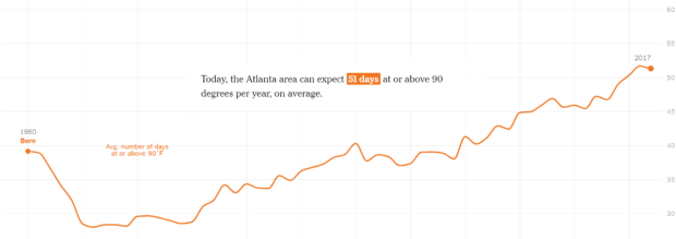
TheNYT and Climate Impact Lab created a graphic that’s supposed to show readers how many more days at or above 90 degrees they could expect today in their home town from when they were born — their data only goes back to 1960, though.
The question is: how accurate is TheNYT’s representation of the change in days at of above 90 degrees? Well, at least for U.S. cities, it seems to be misleading.
“This is [a] waste of time,” quipped Dr. Ryan Maue, a Cato Institute adjunct scholar, in a tweet sent out Sunday night. Maue ran the numbers for Atlanta and got a different answer than what TheNYT showed for the city.
https://twitter.com/RyanMaue/status/1036426016531668992
Here’s what TheNYT told showed readers who grew up in Atlanta:

So, why is there a difference between the observed record and what TheNYT reports?
One reason is because TheNYT uses a “21-year rolling average” to tell readers how many hot days they could expect the year they were born — not the actual number that were observed.
The second reason is because TheNYT’s data past 2000 is blended with a climate model tuned to future climate projections. After 2020, TheNYT notes, “the data uses a mixed climate model that captures a broad range of extreme temperature responses.”
“The future projection shown here assumes countries will curb greenhouse gas emissions roughly in line with the world’s original Paris Agreement pledges,” TheNYT notes.
What’s also apparent is the starting point for TheNYT’s data is in 1960 at the beginning of a rash of years with relatively few days with soaring temperatures. By starting their data in 1960, TheNYT ignores the decades before with a number of 90 degree days on par with today.
However, TheNYT uses this model-blended data to claim Atlanta “is likely to feel this extra heat even if countries take action to lower their emissions by the end of the century.” The paper quotes experts who warn that human health and agriculture will suffer as a result.
“If it’s also humid, humans can’t physiologically evaporate sweat as easily, and we can’t cool down our bodies effectively,” Climate Impact Lab’s Kelly McCusker told TheNYT.
“Food, water, energy, transportation, and ecosystems will be affected both in cities and the country. High-temperature health effects will strike the most vulnerable,” echoed the group’s leader Cynthia Rosenzweig, a scientist at the NASA Goddard Institute for Space Studies.
While future warming is up for debate, what’s not is the historical record. TheNYT’s model-blended temperature charts cities around the country, however, doesn’t seem to reflect the actual number of days at or above 90 degrees — at least in the U.S. where there is a robust temperature record.
Maue also examined station data from Washington, D.C., and again found it looked nothing like TheNYT’s ominous graphic showing a drastic increase in the number of hot days people can expect.
https://twitter.com/RyanMaue/status/1036429627059855360
Again, notice that TheNYT’s starting date of 1960 is around a low point in the number of 90 degree of higher days. D.C.’s data only goes back to 1940, so it’s not as long as many other thermometers in other cities.
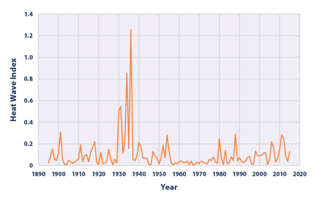
If TheNYT wanted to exaggerate a trend toward more 90 degree or hotter days, then starting in 1960 would accomplish that, but doing so ignores the warm period during the 1930s. In fact, the latest National Climate Assessment report noted the “Dust Bowl era of the 1930s remains the peak period for extreme heat.”
That heat is also evident in heat wave data presented by the Environmental Protection Agency (EPA). No other decade even comes close to the 1930s in terms of the heat wave index.

Readers should use TheNYT’s temperature tool to check out modeled trends for their own home towns, then compare it to observed temperature data. The results could be surprising.
– – –
Michael Bastach is a reporter at Daily Caller News Foundation. Follow Michael on Facebook and Twitter.


